Meet Here, Stay Here: Award-Winning Sales Collateral
University of Georgia Center for Continuing Education & Hotel, Winter 2023
During my time at the Georgia Center, the Sales & Event Management department requested a visual refresh to their previous sales collateral. Though the previous material they were using was consistent with the Georgia Center brand, it was not as eye-catching or dynamic as material from competing hospitality venues. Over the span of a few weeks, I created a design system for multiple print pieces, then co-authored and presented an award-winning poster that described the process for the 33rd Annual Public Service and Outreach Meeting and Awards Luncheon.
Brand Identity

Initial Brief
The Sales & Event Management division at the Georgia Center submitted a job request to fix two problems with their previous print collateral. First, their sales collateral was visually lacking compared to local competitors in hospitality. Print materials were functional but not eye-catching to passersby, compared to competitors that used bright colors and bold layouts to stand out. Second, the Sales division had two documents total to hand out to prospective clients; from conference spaces and catering to hotel rooms and transportation, all of the Georgia Center’s event hosting capabilities simply could not be showcased with only two double-sided letter-sized handouts.
Other competitors in hospitality employed bright colors and bold layouts to catch the attention of prospective guests.
In comparison, the Georgia Center’s previous collateral faded into the background and weren’t nearly as eyecatching.
To solve the first problem, the Georgia Center's handouts needed a fresh coat of paint. One of the Georgia Center's hospitality competitors had recently rebranded themselves with a photographic focus and significantly less text, using pictures and a bold spot of red to draw people's eyes. The head of Sales & Event Management requested that we take inspiration from said approach, citing the curved footer and UGA’s signature Bulldog Red as elements that they wanted to include in the new collateral suite.
As for the second, the lack of breathing room for all of the venue’s event capabilities could be solved by simply creating more handouts. While the Sales division originally requested five or so documents to produce, the scope of the project grew over time to include eight total documents. This necessitated creating a stable design system that could encompass both eye-catching visuals and large swaths of text, fitting either advertising or internal planning documents as the need arose.
Room for Improvement
In order to create the design system for the entire new suite of collateral, I started by first reworking the old map and info sheet that the Sales team usually distributed. By examining the handout, I was able to pinpoint some spots where things could be improved and start establishing a bold new visual identity while also improving user experience.
The old map and info sheet that the Sales team used contained lots of white space, aside from some image headers. There isn’t much emphasis on the brand palette, and the contents are unremarkable at a glance. The map is also awkwardly split between both sides, requiring readers to flip the page multiple times to get a sense of the building’s layout.
The new map and info sheet is much bolder and more colorful, grabbing the attention of any passersby with its signature Bulldog Red. The map has been consolidated onto one side of the page for easy reading, and its colors have been changed to closer match the brand palette. Amenities have all been moved to the back for convenient reference, and bold headings using UGA’s secondary colors help readers to easily locate information.
Carrying on the System
After reworking the map and info sheet, I took note of some staple elements from the new document to carry over to the new ones. The new design system kept the curved footer with UGA's classic red that the client requested, black, and white brand colors as its primary palette.
To add more hierarchy and avoid too much monotony in the design, I incorporated a couple of UGA's secondary colors (Olympic blue, Herty Field green, and Odyssey purple) for use in headings and accents. The all-caps headings of Trade Gothic in these strips add visual interest, clearly delineate sections, and reflect the university's style with a unique spin the Georgia Center could claim for its own.
Here are a few examples of the handouts created, showcasing the versatility of the design system across multiple different pieces of collateral.
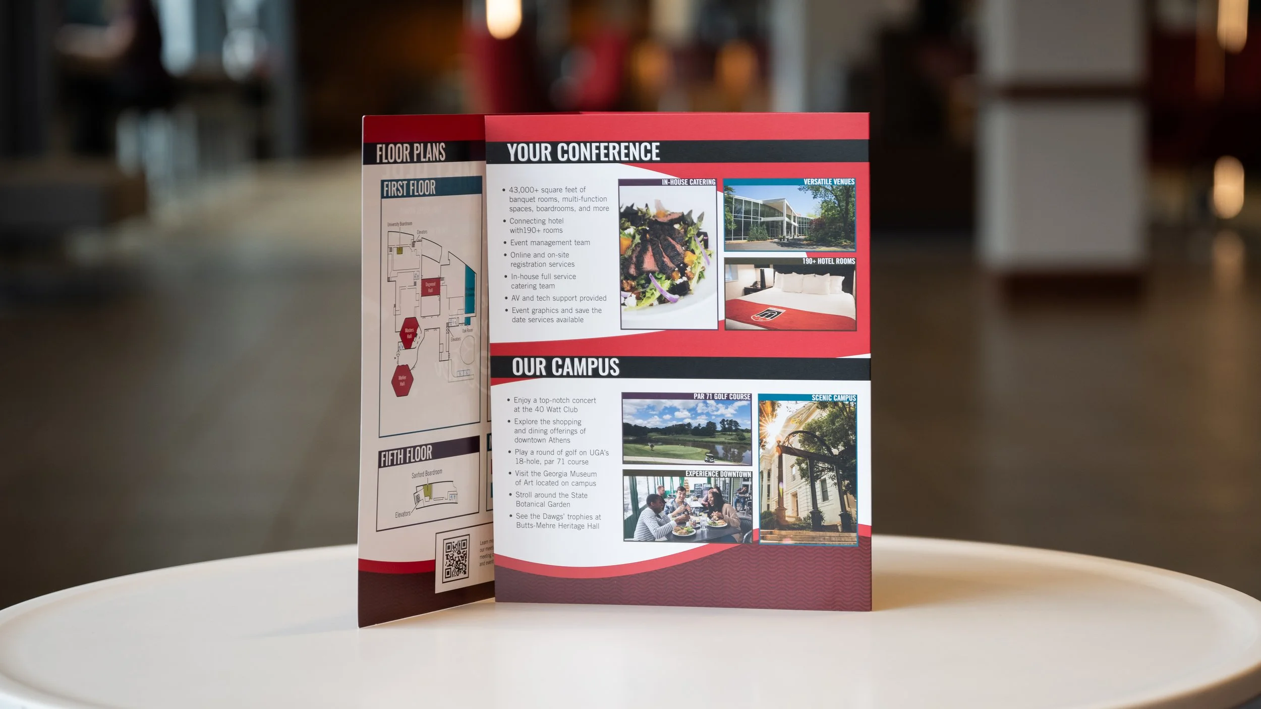
A cover image for a Georgia Center informational trifold. The main idea was to promote the joint conference venue and hotel and highlight a few key points while showcasing relevant imagery. The promo mark featured in the center was designed by the Georgia Center’s previous graphic designer, and its distinctive curves were heavily referenced in the rebrand.
A promotional one-pager aimed at prospective clients outside of Athens. This highlighted a short list of bullet points alongside some relevant pictures, all while keeping a dynamic background moving through the page to guide readers’ eyes.
A restaurant guide for potential clients and guests. This page focuses on densely packing lots of information into a two-column layout, offering readability and accessible information despite the amount of entries included.
A guide to available audio-visual equipment rentals and their prices. This handout demonstrates list hierarchy as well as multiple spaces to place accompanying information, such as callout boxes or extra text in the footer.
Poster Design
Poster Development
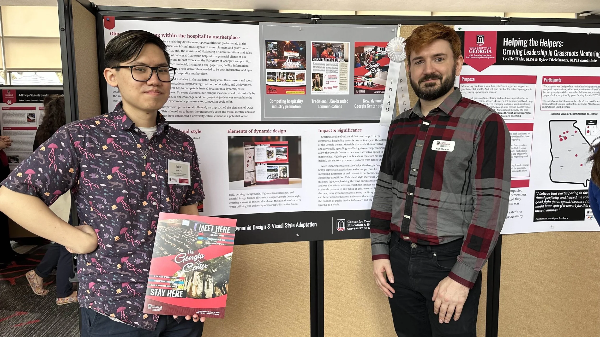
After designing all of the requested collateral for the Sales team, my supervisor requested that I create an academic poster to summarize our new advertising approach and present it to Public Service and Outreach during their 33rd Annual Meeting and Awards Luncheon. Since this was the first time I had ever worked on a poster for such an event, he also helped me co-author each section’s contents before adding them to the official poster template.
While the original request was to update sales collateral to compete with other hospitality venues, the majority of UGA uses the school’s academic-focused branding to great success. As such, we decided to submit our poster to the Innovation category, focusing on the adaptation of tools from UGA’s academic brand assets for new use in the commercial hospitality marketplace.
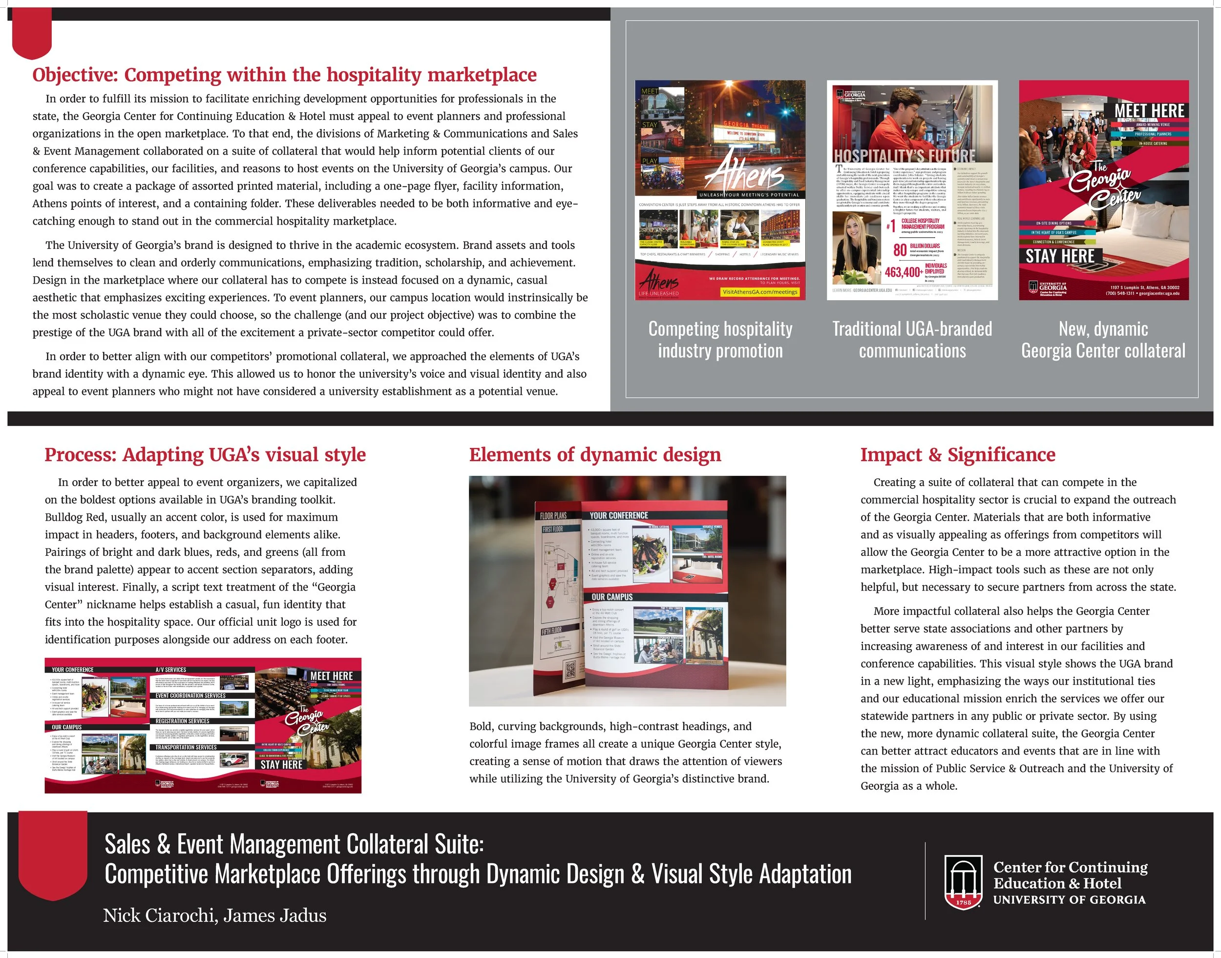
Our finished poster included brief explanations of why a suite of updated collateral was necessary, how I established a new brand identity while staying within UGA’s brand guidelines, and how the updated design would impact Public Service and Outreach and UGA as a whole.
Poster Presentation
Once the poster was submitted and the awards luncheon rolled around, I was pleasantly surprised to see that it had won third place in the Innovation category. The grading rubric stated that while our poster and the Georgia Center’s new brand identity were both strong, it did not include as many examples of real, relevant impact as it could have.
Since the collateral rebrand was still very new at the time of submitting the poster, our department unfortunately didn’t have any concrete data on how the new look helped secure new clients or attract educators in line with the PSO mission. Nevertheless, we received plenty of positive comments about the new rebrand, and the Georgia Center continues to use my updated visual system to this day. I’m certainly proud of what I managed to accomplish during my time as a temp worker!