
Travel Project: Promo & UX
Digital Platforms, Fall 2021
The Digital Platforms Travel Project prompted students to create both an app concept representing a certain aspect of a chosen city and a series of print promotions representing the city itself. I chose to focus on Orlando in honor of a friend's wedding and the time I’ve spent there in my childhood. The posters crafted represent the span of a day in Orlando at the city’s three most popular theme parks, and the app concept leans into the theme park aspect to help users plan their day and navigate to points of interest.
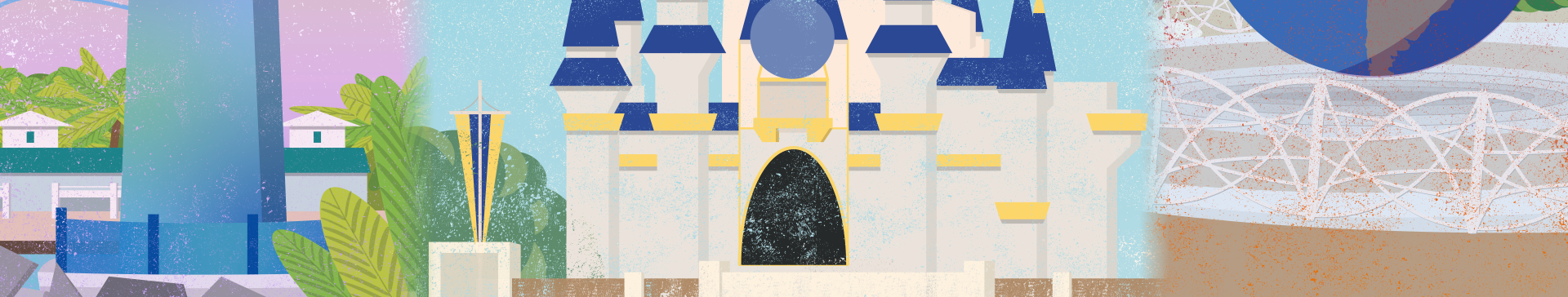
Poster Design
Research & Planning
In the initial stages of the project, I researched the city of Orlando and its theme parks. By creating a mind map to sort Orlando’s many facets, I was able to focus on the city’s tourism spots for my project. I then created assorted thumbnail sketches focusing on potential points of view when visiting the city’s main attractions.
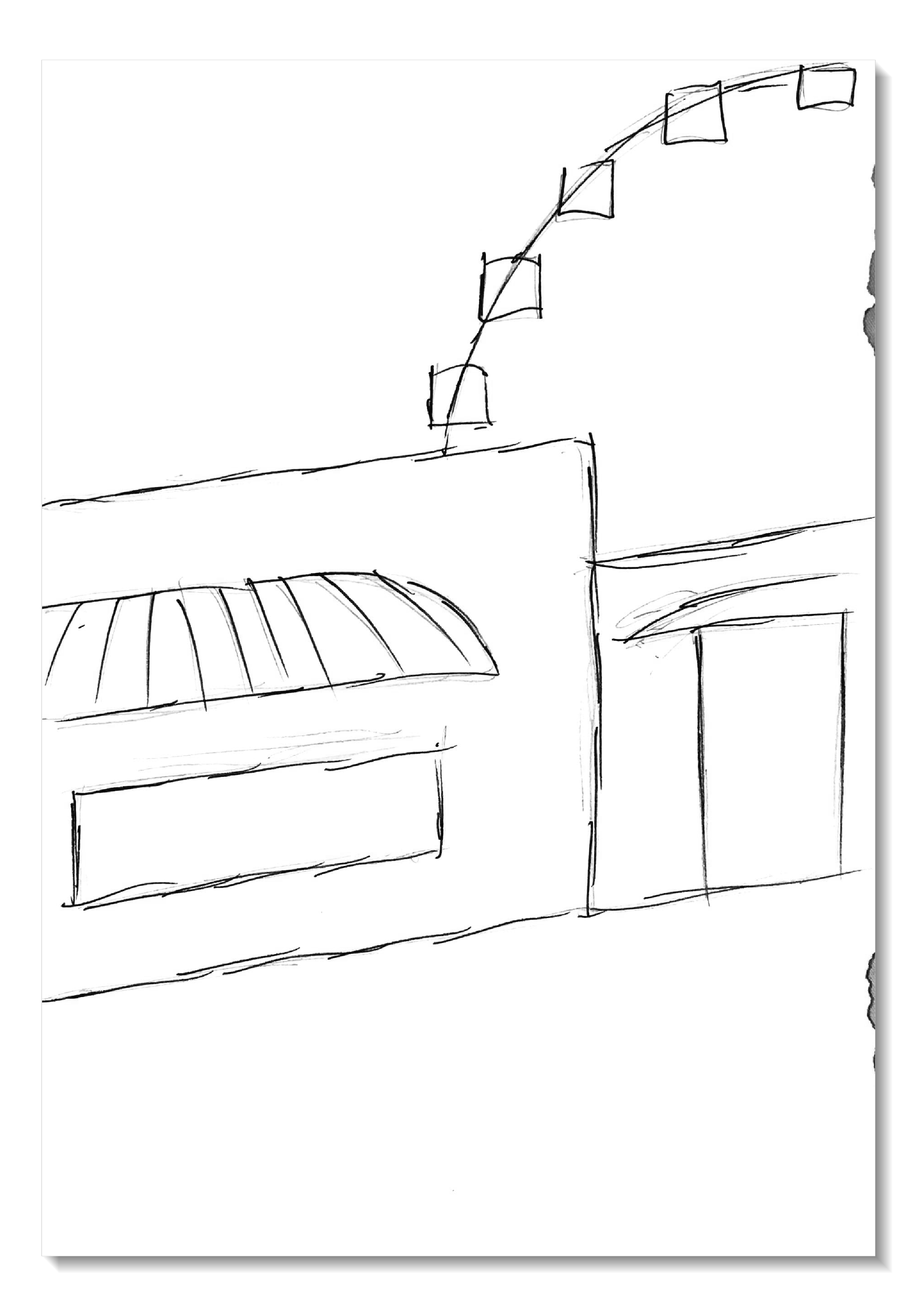
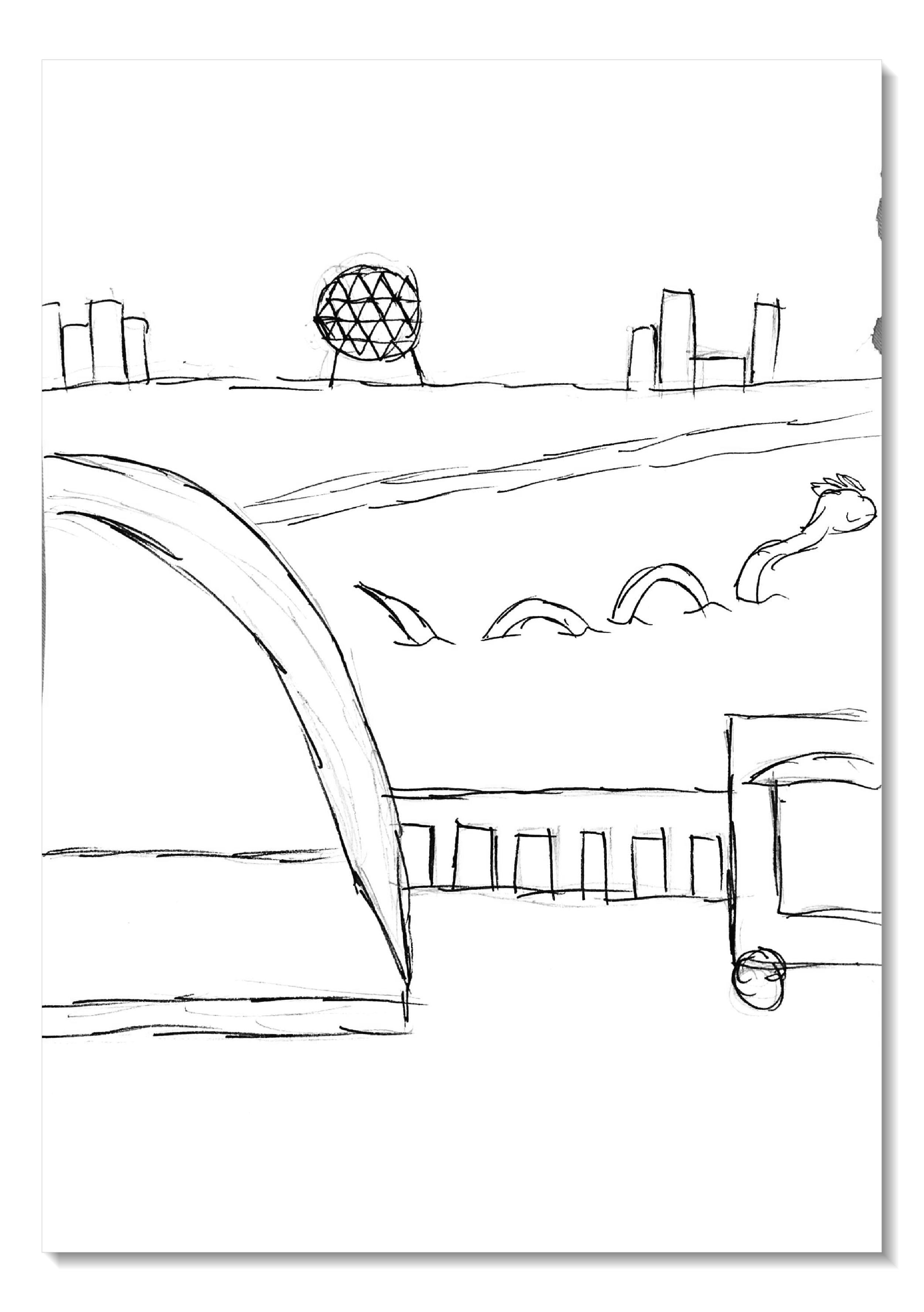
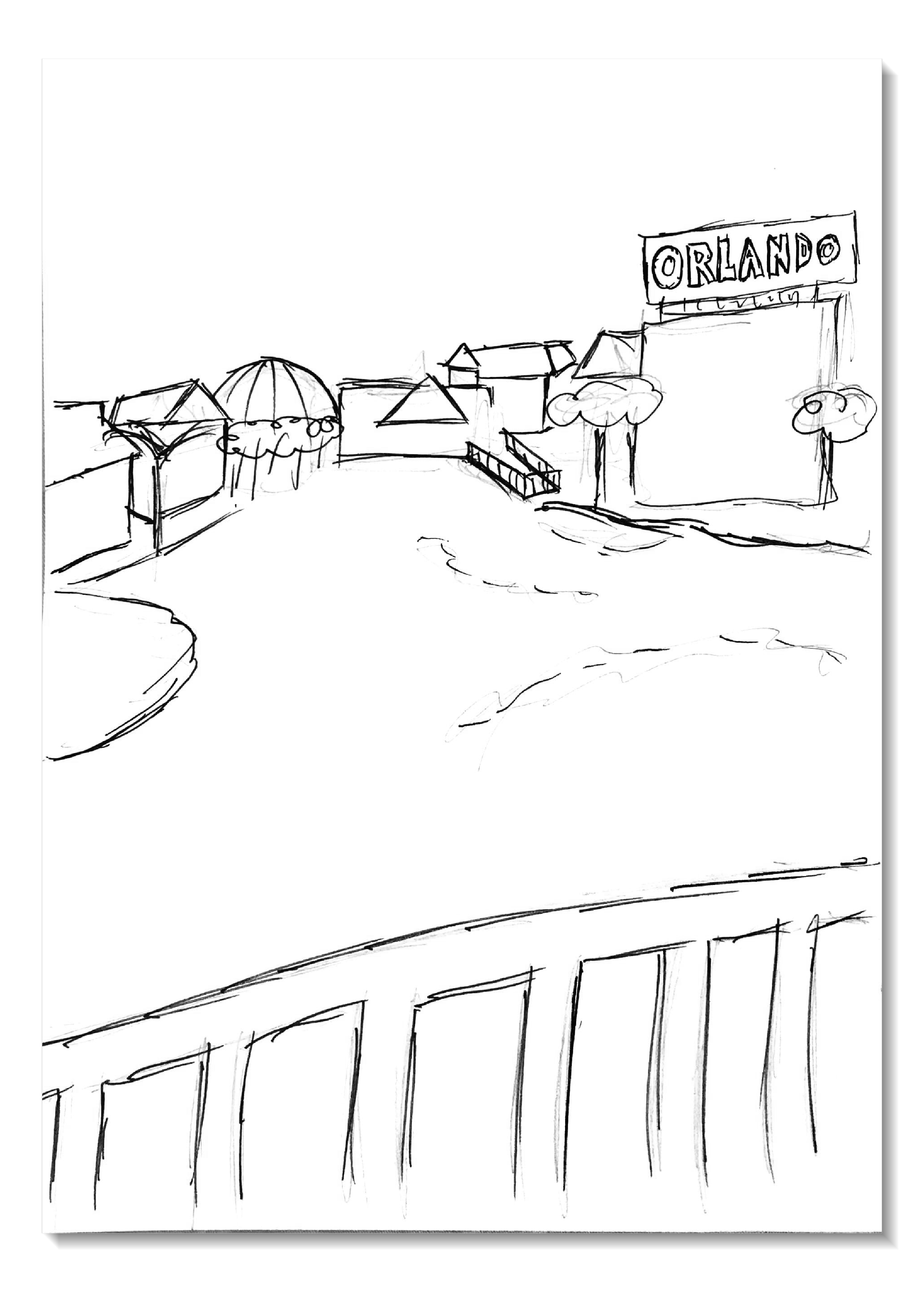
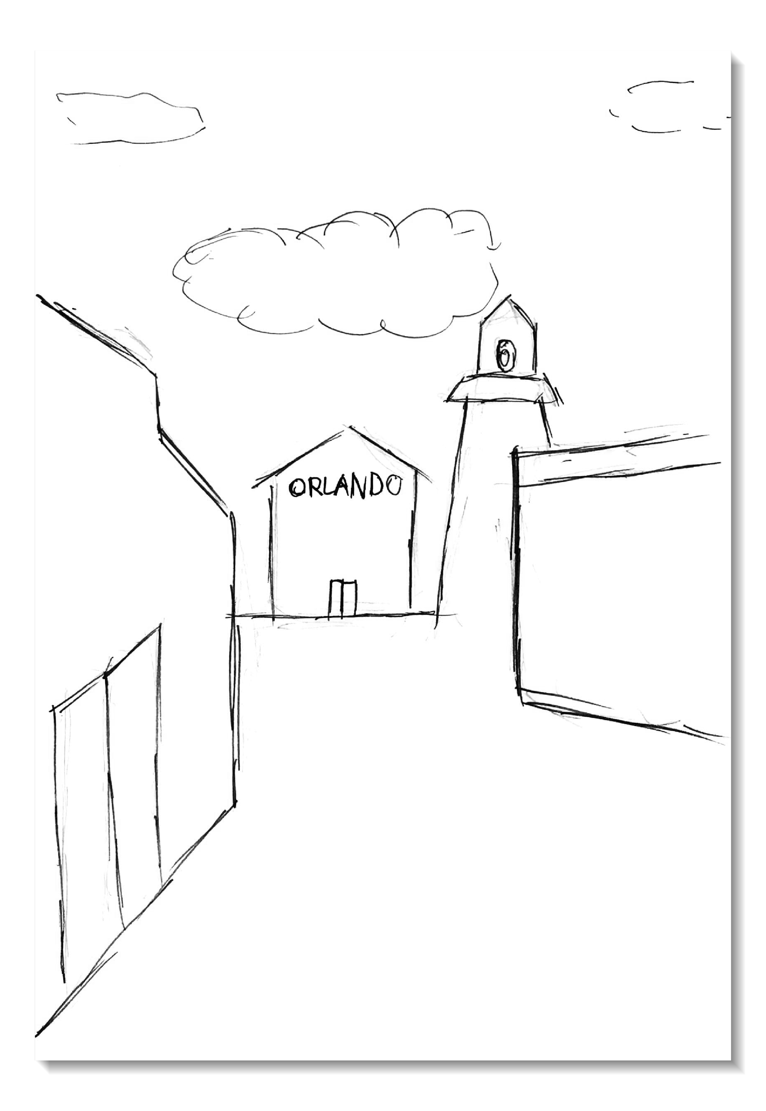
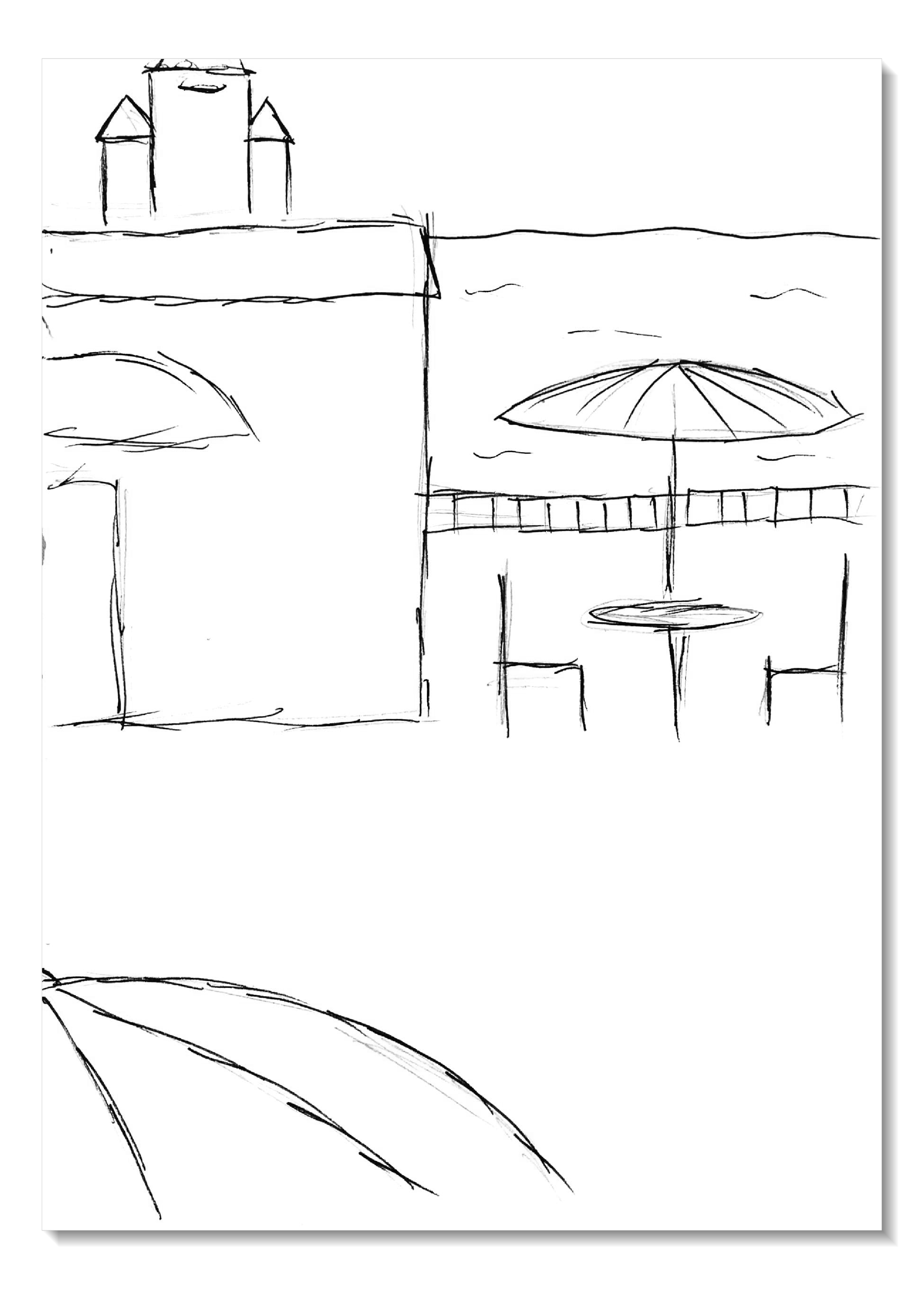

Digital Roughs
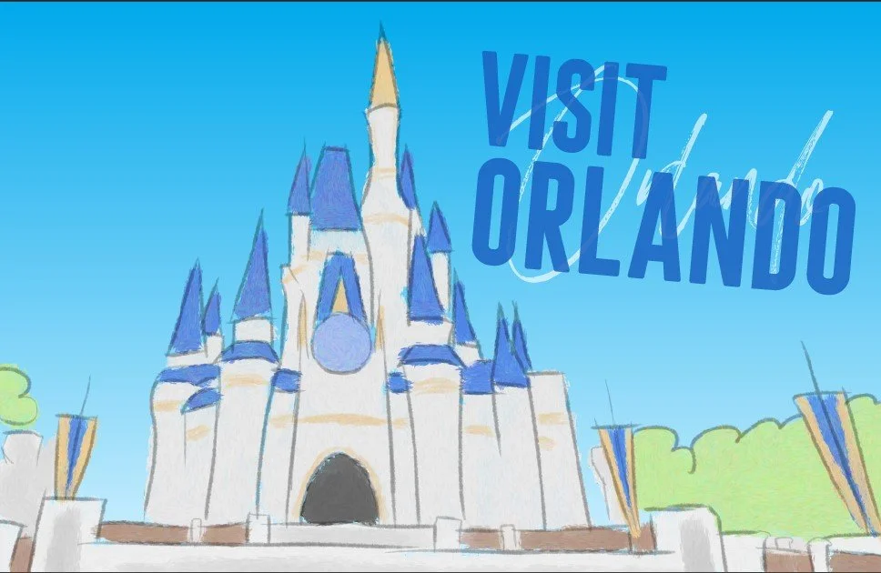
After creating numerous sketches to see what parts of Orlando I would focus on, I then created digital rough mockups of what the city’s landmarks might look like when stylized. I then chose three of these compositions to refine into illustrations later.


Final Posters
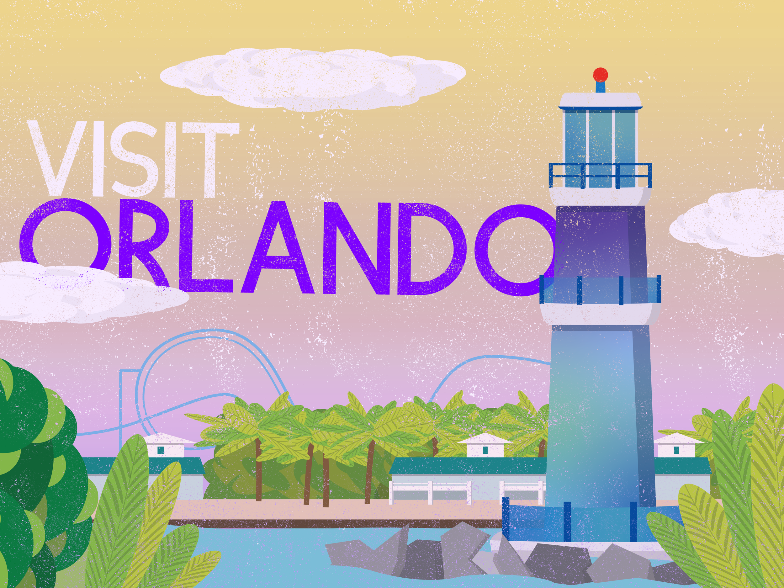
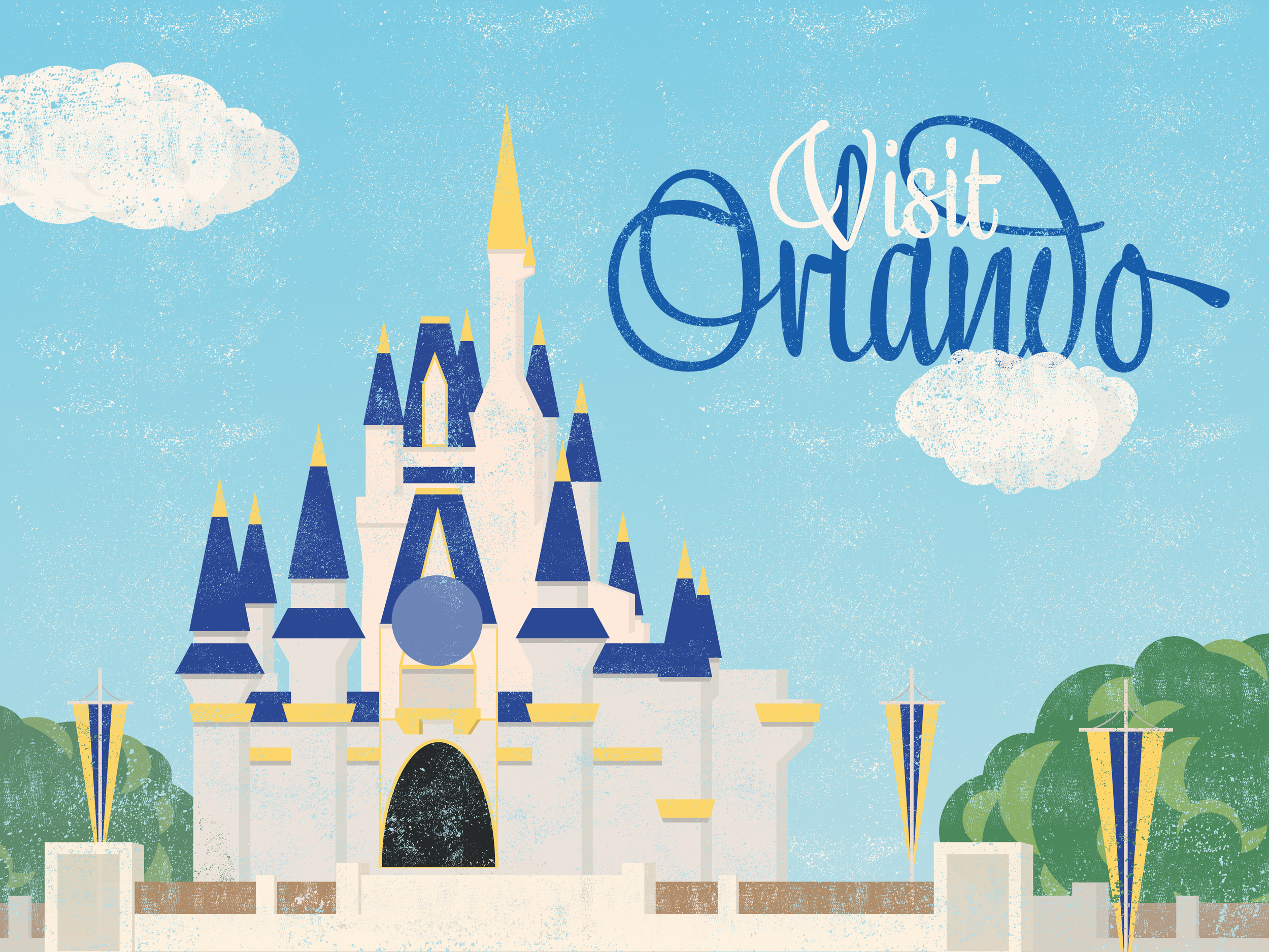
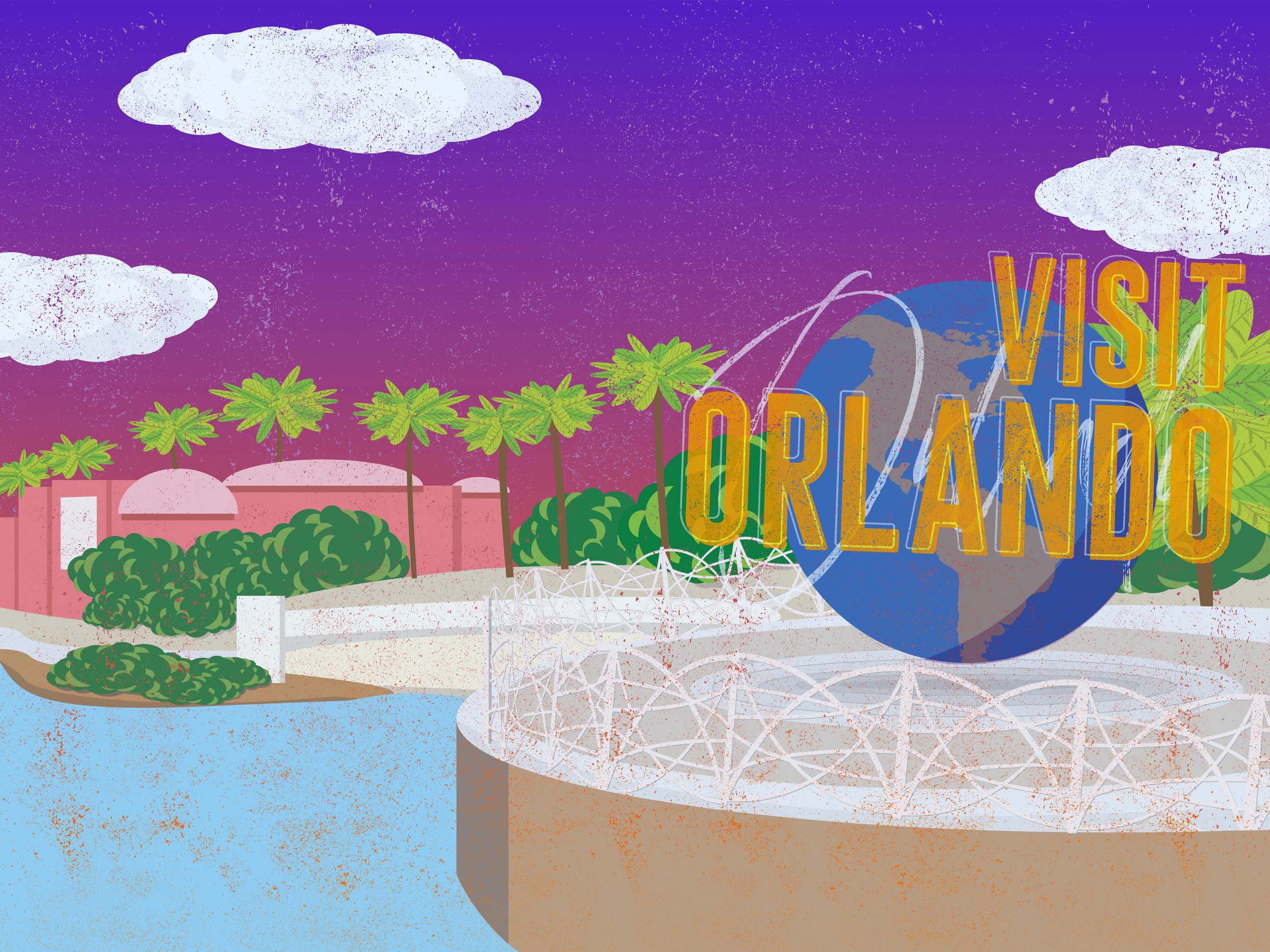
Once I decided on the final three landmarks of the SeaWorld lighthouse, Magic Kingdom castle, and Universal globe, I refined them into a cleaner style with Ilustrator. I changed the typography to reflect their respective parks and changed the backgrounds to illustrate the passage of time.
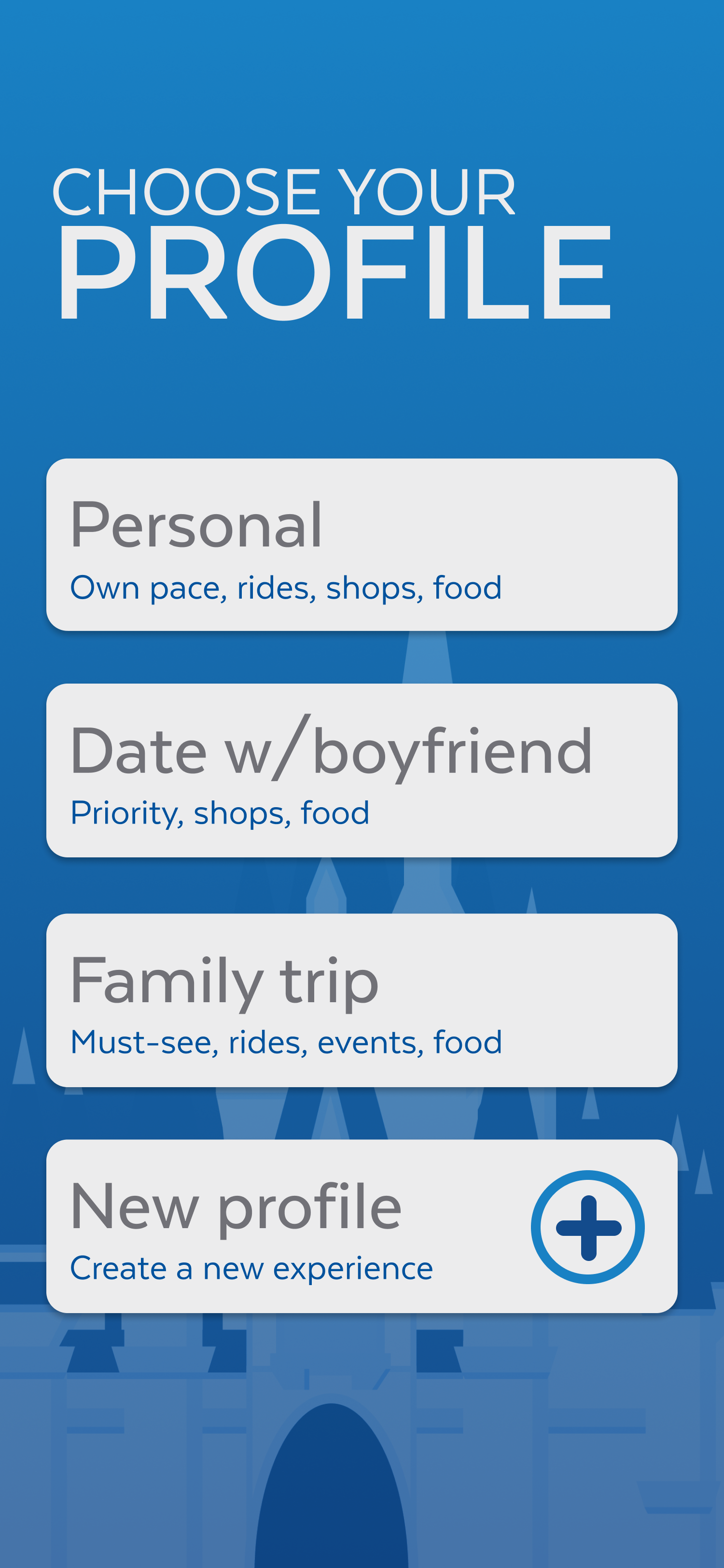
UI/UX Design

Wireframe &
Style Guide
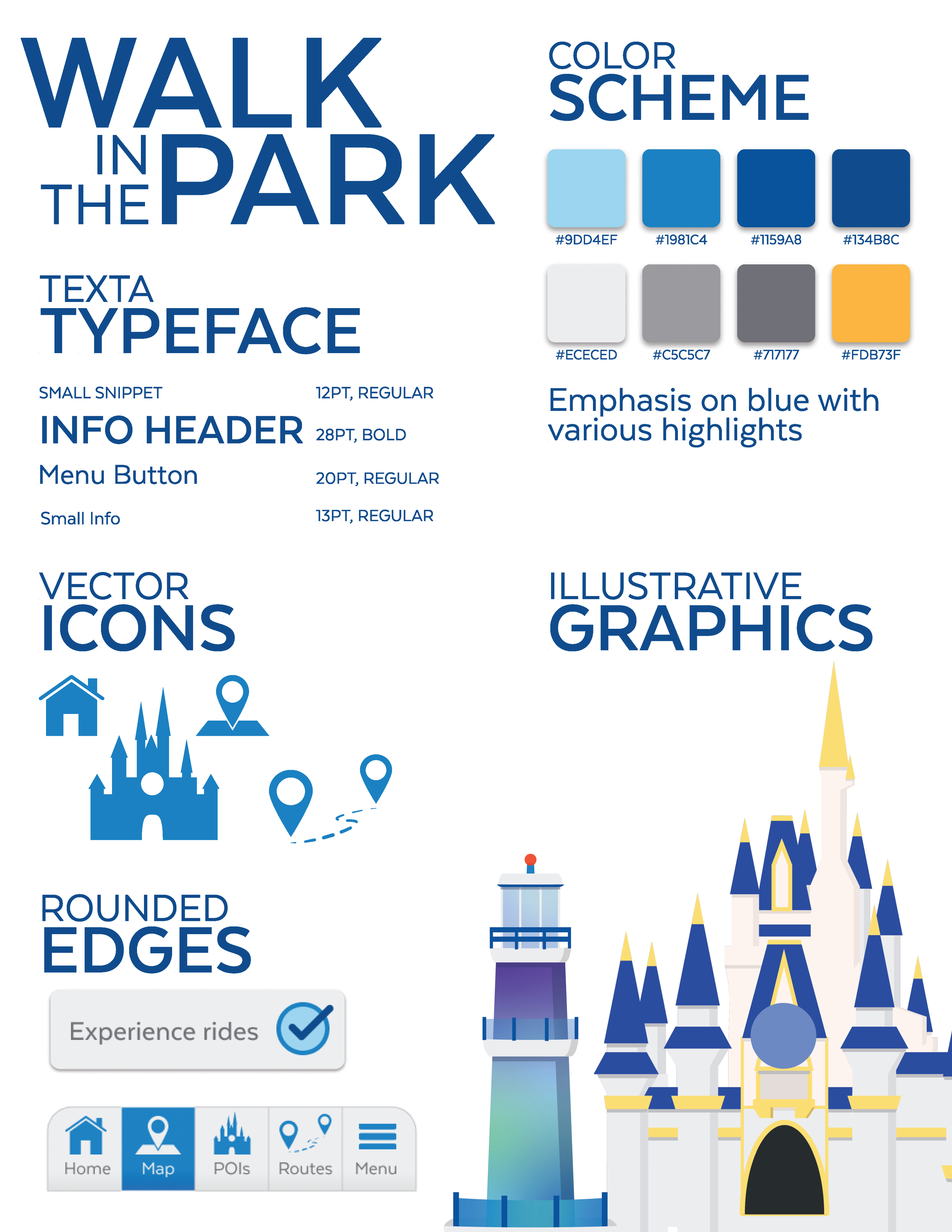
In the initial stages of the UX design component, I wanted to tie in the app’s functionality with the already designed posters. As a result, the app’s concept developed into an app that could both help plan out someone’s day at a theme park and save a route for later reference. The first stage was creating a wireframe for app functionality and a style guide inspired by Orlando’s city branding to unify all its elements.
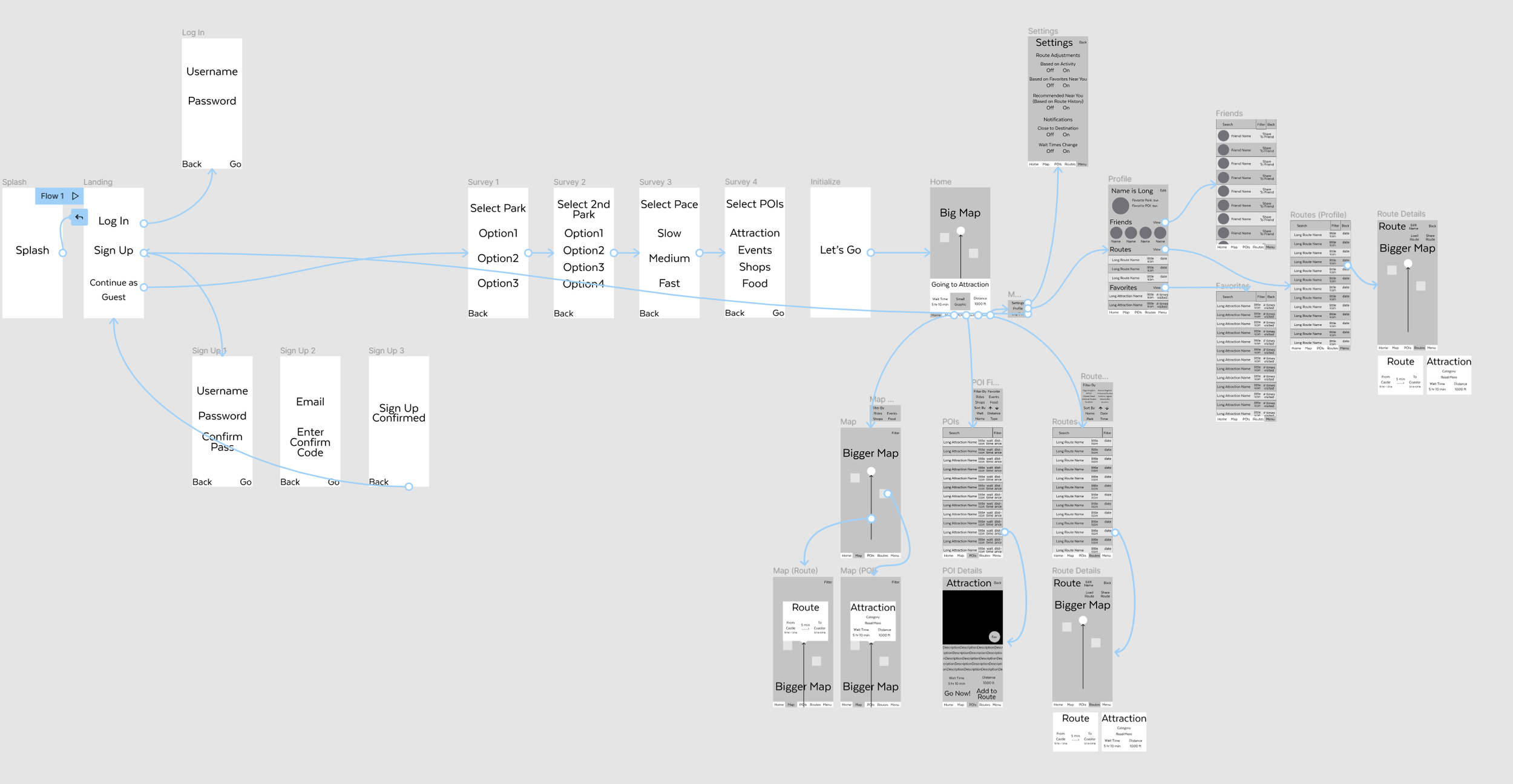
Developing UX
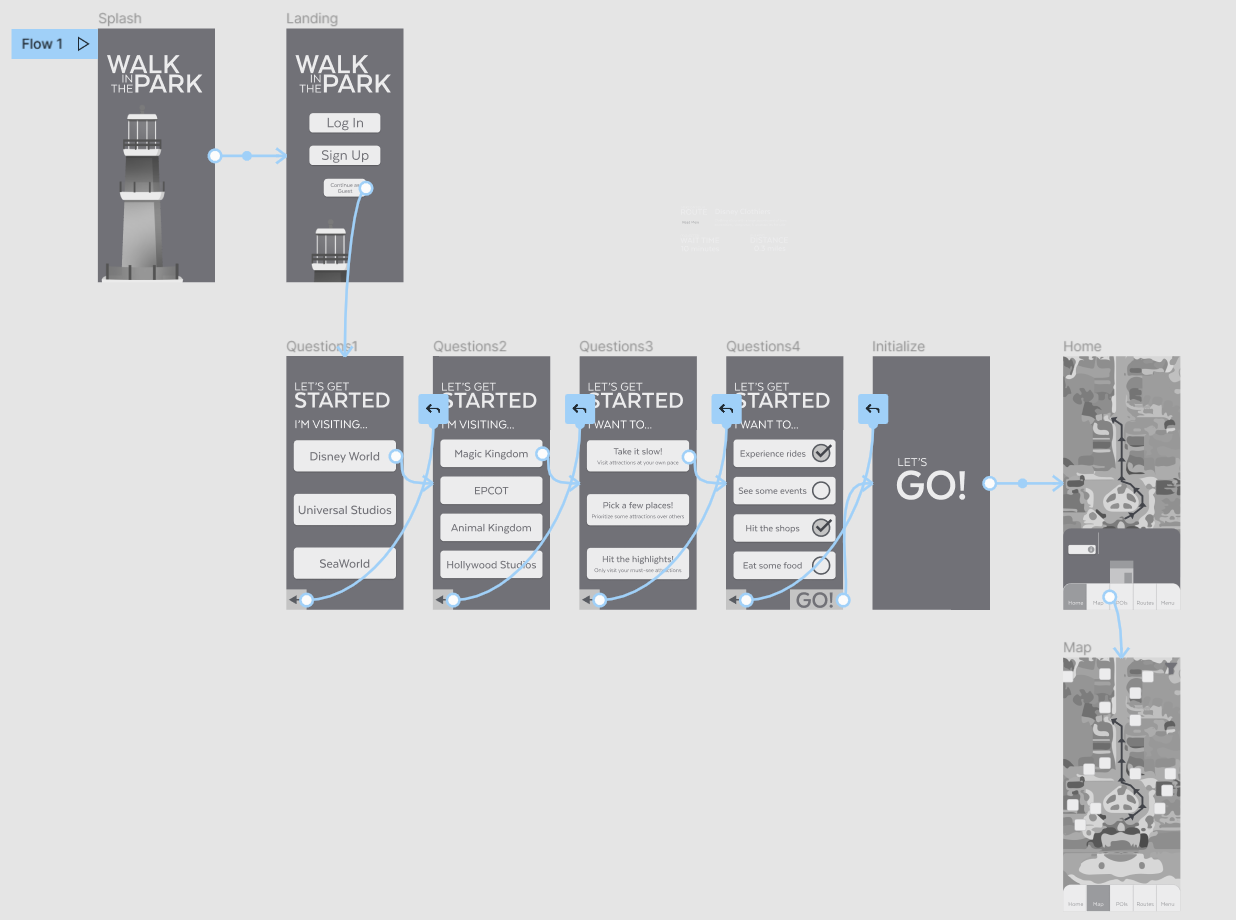
As the project continued, I started plugging elements of the style guide into the already existing wireframe. I made sure to tweak elements as I went, making sure everything was legible and well laid out for the intended user experience.
Finalizing UX
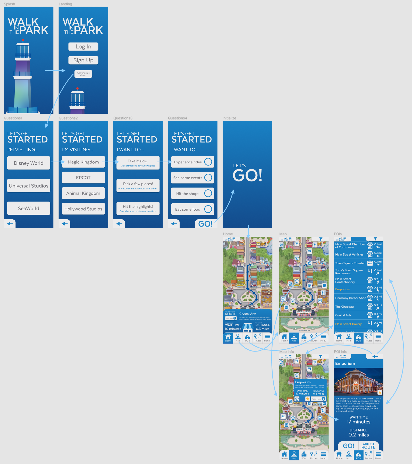
Once the visual system of the app design was refined through trial and error, I implemented the style guide across every screen of the mockup and added the finishing touches to interactivity and overall polish.